We brainstormed for concept for the book. From the oclouring to content. At first, we wanted to create a self-help book. One of our ideas will be designing a book that educate children about divorce. Another idea was on the how kids can handle sch bullies. Finally, we decided on working on puberty, which will serves to inform kids about some of the bodily changes they will be facing soon.
The plot:
The story depict of a typical day of a child's life. The usual routine of waking up, brushing teeth, putting of change of clothes, eating his breakfast, heading to school and back from school. Along the way, he discovered many changes taking place, making im imagine he is a monster, hated by all. he does not realise that hese are actually signs of him growing up. Upon careful explanation by his parents, Wallace realised these changes are natural and there’s nothing to be afraid or ashamed about.
Designing
After coming up with the storyline, we came up with a thumbnail plot.. Here is one of the example:
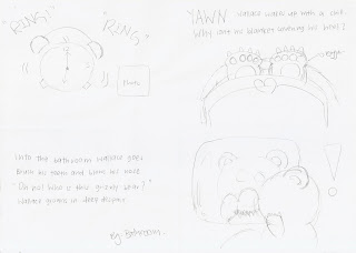
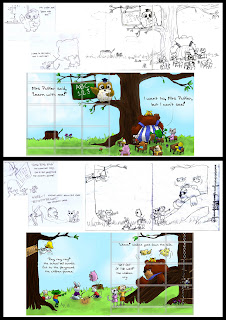
From there, we slowly incorporate more ideas into it. To let our imagination flow and all. Such as the classroom scene, we decided to bring the whole scene to the outdoor:]
Observe we used grids to guide us as well:]
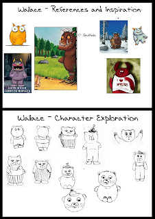
Developing wallace was the toughest for this whole project. In the beginning, we wanted Wallace to be a human. However, human might restrict our ability to transform him into a monster. Hence a bear was chosen in the end, as bear can be seen as either a terror, or a lovely little soft toy.
We had many sketches of Wallace and we can't decide on which is the best. The criteria for Wallace was Wallace to be a monster, yet retain its cuteness. In the end, we drew out inspiration from the illustrator of Gruffalo, and Mei Gui managed to came up with one that all of us fell for:] The following image depict out thought process:
%5B1%5D.jpg)
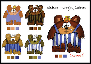
Apart from designing Wallace, we need to colour it as well. The colouring of Wallace will set the tone and colour of the book:] Here is our exploration:]
%5B1%5D.jpg)
We decided on something darker and a little bright to help Wallace stands out from the background. It should be some colour that is not commonly used as the background as well, so to help the colours speak to each other. I believe the tougest part was not colouring, but deciding on which is the easiest way to colour... Hence I devised live tracing and manually closing gaps of traces. Not the best method but its definitely less time consuming:]
Remain consistent was tricky — everyone took charge of different scenes in the bookto save on time. However problem arise when each of us has different drawing and coloring styles. We attempted to overcame this problem by leaving the shading part of the work to one person. If more time was permitted, I would recommend one person sketch the background, the oher person sketch the character, another person to colour bg, another to colour character.. and lastly one person to shade all.
Tight schedule further restricted us from evaluating each other work. But i guess we were all really responsible and created quality work. Hence, not much problem with that.
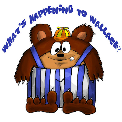
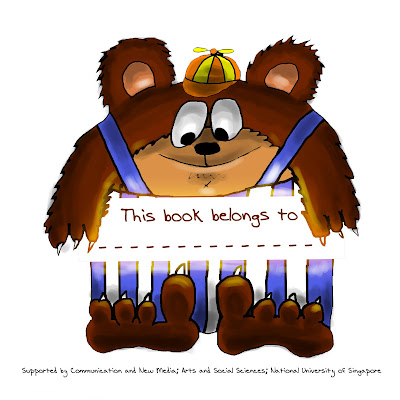
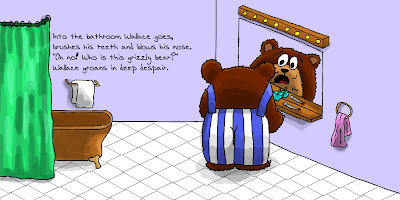
Here is the final work:]

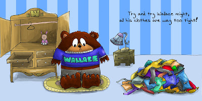
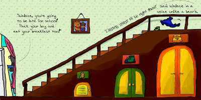
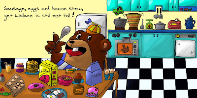
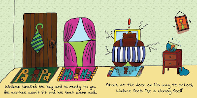
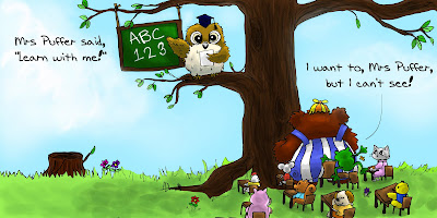
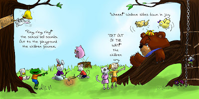.jpg)

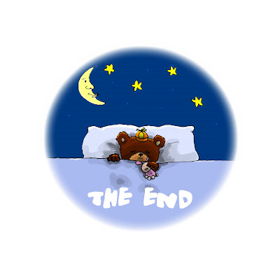
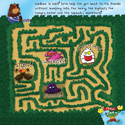
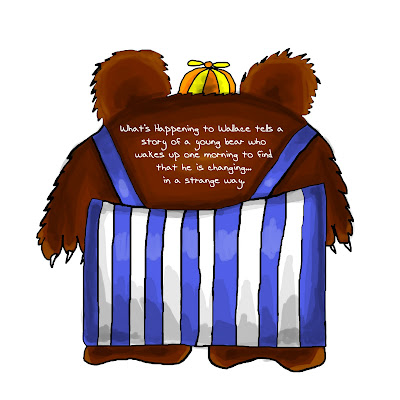
As mentioned, we were tight on schedule, hence for printing, we did not test print, but jut trusted our printer to deliver his work. We faced much constraint as well, since the printer has few selection of printing, and required all printing to be matte + same thickness. Nevertheless, this is compromised with the low cost of printing, around 30 each:]
For presentation, we decided to do a mini skit:] The idea originated from my biz policy class, where we had to describe the essence of the case study in 10min. Using skit is definitely most entertaining, an easiest to convey the message across. I do hope everyone enjoyed it:]
To my group members, if you happen to be reading this, thank you for the nice memories:] it has been fun slogging with everyone and I look forward to see many of your works in the future:]


